
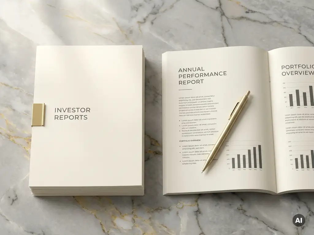
Investor reporting documents carry significant weight. They communicate performance, strategy, and credibility to audiences who scrutinise every detail. Yet even well-researched reports frequently underperform because the way information is presented works against the reader rather than with them. Poor fund reporting design is one of the most common and most overlooked barriers to effective investor communication. Whether the goal is to retain existing investors or attract new capital, the clarity and quality of these materials matter far more than many firms realise.
Improving the readability of investor reports is not simply a cosmetic exercise. It is a strategic decision that shapes how information lands, how quickly decisions get made, and how professional a firm appears. The following principles reflect fund reporting best practices that apply across private equity, wealth management, and asset management contexts.
What makes investor reports hard to read
The most common readability problems in investor documents share a root cause: content is structured around how data is produced rather than how it is consumed. Reports often mirror internal spreadsheets or compliance templates, which prioritise completeness over comprehension.
Dense blocks of text, inconsistent formatting, and an absence of visual hierarchy all contribute to cognitive overload. When every element on a page carries equal visual weight, the reader has no natural entry point and no clear sense of what matters most. Footnotes that interrupt the reading flow, tables without clear labelling, and pages that mix multiple typefaces or font sizes compound the problem. The result is a document that demands effort from the very audience it is trying to persuade.
Typography and layout choices that aid comprehension
Typography is one of the most powerful and least discussed tools in fund reporting design. The right typeface, used consistently and at appropriate sizes, creates a reading rhythm that feels effortless. Serif fonts often work well for body text in printed reports, lending authority and aiding sustained reading. Sans-serif fonts tend to perform better on screen, where rendering conditions vary.
Beyond typeface selection, spacing does much of the heavy lifting. Generous line spacing, clear paragraph breaks, and well-defined margins reduce visual noise and allow the eye to move through content without fatigue. A strong typographic hierarchy, where headings, subheadings, body text, and captions are visually distinct, helps readers navigate quickly and locate the information most relevant to them. These are not decorative decisions. They are functional ones that directly affect how much of the report actually gets read.
Turning complex data into clear visual narratives
Financial data is inherently complex, but complexity does not have to mean confusion. The challenge is translating numbers into meaning without oversimplifying or misrepresenting the underlying story.
Charts and infographics, when designed with intention, can compress large amounts of information into a format that is immediately intelligible. The key is choosing the right visual format for the data type: bar charts for comparisons, line graphs for trends over time, and pie or donut charts only where proportional relationships are genuinely the point. Colour should be used purposefully to differentiate data sets or draw attention to key figures, not decoratively. Equally important is what gets left out. A well-edited visual that communicates one clear insight is almost always more effective than a dense chart that tries to show everything at once.
Pairing visuals with concise explanatory text, rather than leaving charts to speak entirely for themselves, reinforces the narrative and ensures the intended message is not lost in interpretation.
Structuring content for different investor audiences
Not all investors read reports the same way. Some want a high-level summary of performance and outlook. Others will go straight to the portfolio detail or the risk section. Effective report structure anticipates these different reading behaviours and accommodates them within a single document.
A clear executive summary at the front of the report serves readers who need the key points quickly. Detailed sections that follow should be clearly signposted so that more analytical readers can navigate directly to what they need. Layering information in this way, from the strategic to the granular, respects the time and priorities of different audiences without sacrificing depth for those who want it.
For firms managing multiple fund strategies or investor types, it is worth considering whether a single report format serves all audiences equally well, or whether tailored versions would deliver a stronger experience. The investor relations materials that perform best are those designed with a specific reader in mind from the outset.
The role of brand consistency in investor communications
Brand consistency in investor reporting goes beyond placing a logo on the cover. It encompasses the colour palette, typography, tone of voice, and visual language used throughout every document a firm produces. When these elements are applied consistently, they create a cumulative impression of professionalism and reliability that reinforces trust over time.
Inconsistency, by contrast, signals a lack of attention to detail. A report that uses different fonts across sections, applies brand colours inconsistently, or presents data in a style that does not match the firm’s website or other materials creates a fragmented experience. For investors who receive communications from multiple managers, a polished and coherent presentation stands out. Brand consistency is not a superficial concern. It is a direct reflection of how a firm operates.
Working with a specialist agency to elevate report design
Improving the readability and visual quality of investor reports requires a particular combination of skills: an understanding of financial content, design expertise, and the ability to translate complex information into clear, engaging formats. These capabilities are not always available in-house, and generic design agencies rarely bring the sector-specific knowledge needed to get it right quickly.
Working with a specialist who understands the regulatory context, the expectations of sophisticated investors, and the nuances of fund reporting best practices means the process is faster, the output is more effective, and the risk of misrepresentation or misjudgement is significantly reduced. The investment in quality design at this level pays dividends in the impression it creates and the clarity it delivers across every reporting cycle.
How Best&Co. helps with investor report design
Best&Co. is a London-based brand design agency working exclusively with corporate and financial services firms. With over 20 years of experience in fund reporting design and investor communications, the team brings both creative expertise and deep sector knowledge to every project. For firms looking to improve private equity fund reporting or raise the standard of their investor materials more broadly, Best&Co. offers a focused, specialist approach.
Working with Best&Co. on investor reporting typically involves:
- A thorough review of existing report formats to identify readability and design gaps
- Development of a clear typographic and visual hierarchy tailored to the firm’s brand
- Redesign or creation of data visualisations that communicate performance clearly and compellingly
- Consistent application of brand identity across all investor-facing materials
- Close collaboration with the client team to ensure accuracy and alignment throughout
The result is investor documentation that reflects the quality of the firm behind it. To discuss how your reporting materials could be improved, get in touch with the team at Best&Co.
Related Articles
- Why investor relations materials reflect the quality of your firm's brand
- How to structure an investor report that communicates complex data simply
- How to approach the design of a private equity annual report
- How to make complex financial data more accessible to investors
- What fundraising materials do private equity firms need and why