
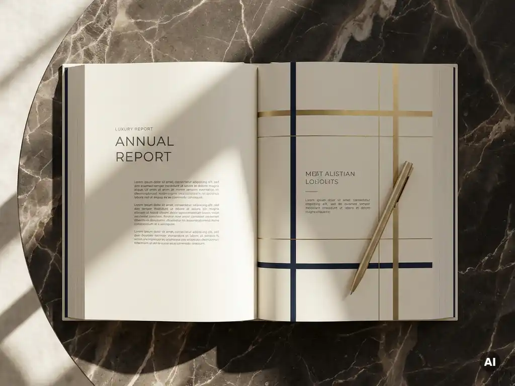
A private equity annual report is one of the most consequential documents a firm produces each year. It lands in the hands of LPs, prospective investors, and advisers who use it to form judgments about performance, governance, and the quality of the team behind the numbers. Getting the design and presentation right is not a cosmetic concern: it directly shapes how the firm is perceived. For those working on fund reporting design, the challenge is to produce something that is both rigorous and compelling, structured and readable.
This guide walks through the key considerations involved in designing a professional PE annual report, from understanding what investors actually look for to avoiding the pitfalls that undermine credibility.
What investors expect from a PE annual report
Investors approach a PE annual report with a specific set of expectations. At the most fundamental level, they want clarity: a clear account of portfolio performance, value creation, and the firm’s strategic direction. But beyond the numbers, they are also assessing the firm itself: its professionalism, its transparency, and its ability to communicate complex information in a coherent way.
LPs in particular are experienced readers of these documents. They notice when information is buried, when language is evasive, or when the visual presentation feels rushed. A well-designed report signals that the firm takes its investor relationships seriously. It builds confidence before a single figure is scrutinised. That expectation of quality extends to every element, from the cover design to the typography used in footnotes.
Structure and content: What to include and why
A strong annual report follows a logical arc that moves from the firm-level narrative down to portfolio-level detail. The opening sections typically cover a letter from the managing partner, a summary of the year’s highlights, and an overview of the investment strategy. These set the tone and give readers the context they need to interpret the data that follows.
Portfolio company sections are usually the most substantive part of the document. Each entry should cover the investment thesis, progress against value creation milestones, and an honest account of challenges where relevant. Financial statements and fund performance metrics then provide the quantitative backbone. Supporting material, ESG disclosures, team profiles, and governance notes, rounds out the picture. The goal is a document where every section earns its place and contributes to a coherent overall narrative.
How visual identity shapes report credibility
Visual identity does more than make a report look attractive. It communicates consistency, professionalism, and brand maturity. A report that applies the firm’s brand system with discipline (consistent typefaces, a considered colour palette, well-structured layouts) reassures readers that the same rigour extends to how the firm operates.
For private equity firms, where brand awareness may be lower than in consumer markets, the annual report is often one of the primary touchpoints through which investors experience the brand. This makes investor relations design a genuine strategic priority rather than a production afterthought. A fragmented or inconsistent visual approach can inadvertently suggest a lack of internal coherence, not the message any firm wants to send to its LPs.
Balancing storytelling with financial rigour
One of the defining tensions in PE report design is the need to balance narrative with data. Investors want the story (the context, the decisions, the direction of travel), but they also need the numbers to be accurate, clearly presented, and easy to interrogate. Neither element should overwhelm the other.
Effective reports treat financial data as part of the story rather than an appendix to it. Charts and infographics, when used thoughtfully, can make complex performance data more accessible without oversimplifying it. The writing itself should be direct and substantive, avoiding the kind of vague corporate language that investors have learned to read as a signal of something being obscured. Specificity and honesty are what build trust over time.
Digital vs. print: Choosing the right format
The question of format has become more nuanced in recent years. Many firms now produce both a print version for key stakeholders and a digital format for broader distribution. Each has its strengths, and the right choice depends on the firm’s LP base, brand positioning, and sustainability commitments.
Print reports carry a physical weight that digital cannot replicate. A well-produced printed document communicates investment and permanence. Digital formats, on the other hand, offer interactivity, accessibility, and the ability to incorporate video or linked content. They are also easier to distribute and update. Some firms opt for a hybrid approach: a shorter, designed PDF alongside an interactive web-based version. The key is to make a deliberate choice rather than defaulting to one format out of habit.
Common design mistakes in PE annual reports
Even experienced firms can fall into patterns that undermine an otherwise strong report. One of the most common is prioritising volume over clarity, producing a document that is comprehensive in its coverage but difficult to navigate. A long report is not inherently a credible one; structure and hierarchy matter more than page count.
Other frequent issues include inconsistent application of brand guidelines, poor data visualisation that obscures rather than illuminates, and a disconnect between the written narrative and the financial results. Typography choices also deserve attention: dense, small-print text in financial sections is often a missed opportunity to improve readability without sacrificing detail. The best professional investor reports are the ones that feel effortless to read, even when the underlying content is complex.
How Best&Co. helps with PE annual report design
Best&Co. is a London-based brand design agency that works exclusively with corporate and financial services firms, including private equity, asset management, and wealth management businesses. With over 20 years of experience in fund reporting and investor communications, the team brings both sector knowledge and creative expertise to every engagement.
When it comes to annual report design, Best&Co. offers:
- Brand-led design that applies the firm’s visual identity consistently and with purpose across every section of the report
- Structural and editorial guidance to ensure the report follows a logical, investor-friendly narrative arc
- Data visualisation that makes financial and portfolio performance information clearer and more compelling
- Print and digital production, including designed PDFs and interactive digital formats tailored to the firm’s LP base
- ESG and impact reporting integrated into the broader document design where required
The agency works in close collaboration with clients, acting as a genuine creative partner rather than a production vendor. If the design and presentation of your annual report are a priority this year, get in touch with the Best&Co. team to discuss how they can help.
Related Articles
- Why first impressions matter when presenting to prospective limited partners
- What makes a fund report genuinely engaging for institutional investors
- What goes into a professional private equity investor presentation
- How to use design to differentiate your firm in a competitive fundraising market
- How to produce consistent fund reporting across a growing portfolio